Orasave: Multi-Saving and Investment Platform
January, 2026
Fintech
Mobile App
Product Design
TL;DR
Orasave is a mobile-first savings platform designed to help people save money—personally and collectively—while supporting everyday transactions through a trusted marketplace. But Orasave didn’t begin as a product idea. It began as a business that outgrew its own process.
I worked on Orasave as a product designer, helping translate an already-working, trust-based savings system into a scalable digital experience—without breaking what made it work in the first place.
Background - The Problem
Before Orasave became a digital product, it was a system and service. The client had built a sizeable customer base by offering savings services tracked through personal savings ledgers. Customers deposited funds regularly, balances were recorded manually, and trust was built through consistency and human relationships. For a while, this worked. But as the business grew, the system began to show its limits:
Savings records were manually updated
Errors became harder to detect
Onboarding new customers required more human effort
Withdrawals and reconciliations were slow
There was no real-time visibility for customers
The business wasn’t failing. It was scaling faster than its tools allowed. It needed to serve more customers, deliver faster, reduce human error and preserve trust.
Hence the need for the Orasave mobile app. Though this was an obvious solution but that came with its own set of challenges.
User Research - Working with existing Insights
Understanding the Target Users
I didn’t run user interviews or surveys. Instead, I designed with something just as valuable: years of existing customer data and firsthand operational insight from the client. The client knew their customers well:
Many didn’t use email
Some were new to smartphones
Most weren’t interested in “features”
Everyone cared about knowing exactly where their money was
These customers didn’t need motivation to save. They were already doing that. What they needed was:
clarity
speed
reassurance
and a system that felt familiar, not intimidating
That insight shaped every design decision that followed.
The Opportunity
Orasave wasn’t about reinventing savings. It was about making an existing behaviour easier to manage at scale. Rather than redesign how users think about saving, the opportunity was to:
Automate existing processes, improve accuracy and speed
Maximize saving habits with variety of saving methods
Ease funds transfer and receipt with simplified payment and wallet systems
Reduce operational load on staff with robust admin management
Offer users transparent, real time update and control of their savings
Design Approach
Platform Architecture
We designed Orasave as a simple ecosystem with clear roles. There are two main users:
General users, who save, hold wallet balances, withdraw funds, and buy products
Vendor users, who sell products, receive payments, and access more advanced financial tools
Both connect through a shared wallet system. What differs is permission, not complexity. Behind them sits an admin system—intentionally powerful—designed to absorb operational complexity so users don’t have to.
Clarity, Structure & Consistency
I spent some time translating the business logic and operational constraints into low-fidelity screens, rough flows, and layout sketches that focused purely on what goes where and why. These early explorations were done to ensure the product made sense and confirm the layout and UI placements.
High fidelity design was made using the UX Live design system (a colour-theme and token-based design system which I previously built) to provide a library of reusable components and tokenized variables. This ensured visual consistency across the app and ease of scaling.
For icon, I adopted the Phosphor Icon library, chosen specifically for its robust icon pack and variants, and seamless integration with both React (via CDN) and Flutter packages, helping bridge the gap between design and engineering.
In addition to the shared system, I built a mini local component library tailored to Orasave—custom UI elements designed specifically for savings flows, wallets, and group interactions.
Brand & Visual Identity
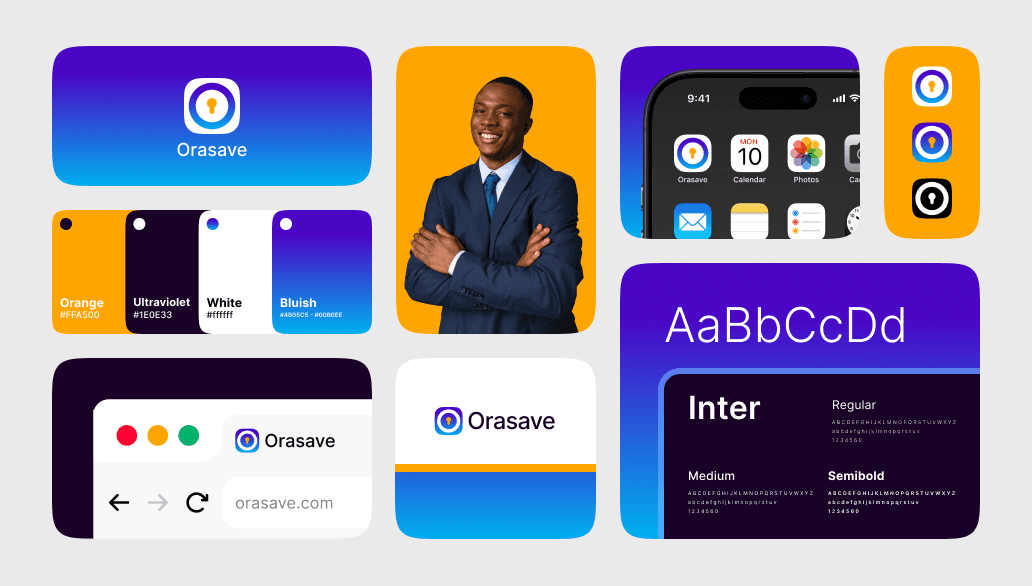
A quiet but important part of the project was the brand identity. Orasave already had brand colours people recognized, but not well presented. Redesigning everything from scratch risked alienating existing users. So I improved the logo/app icon with some restraint, desiand introduced consistency through typography and layout
The goal wasn’t a bold rebrand, it was continuity: the product needed to feel like the same service—just digitised and more reliable.
Core Features
Onboarding & KYC
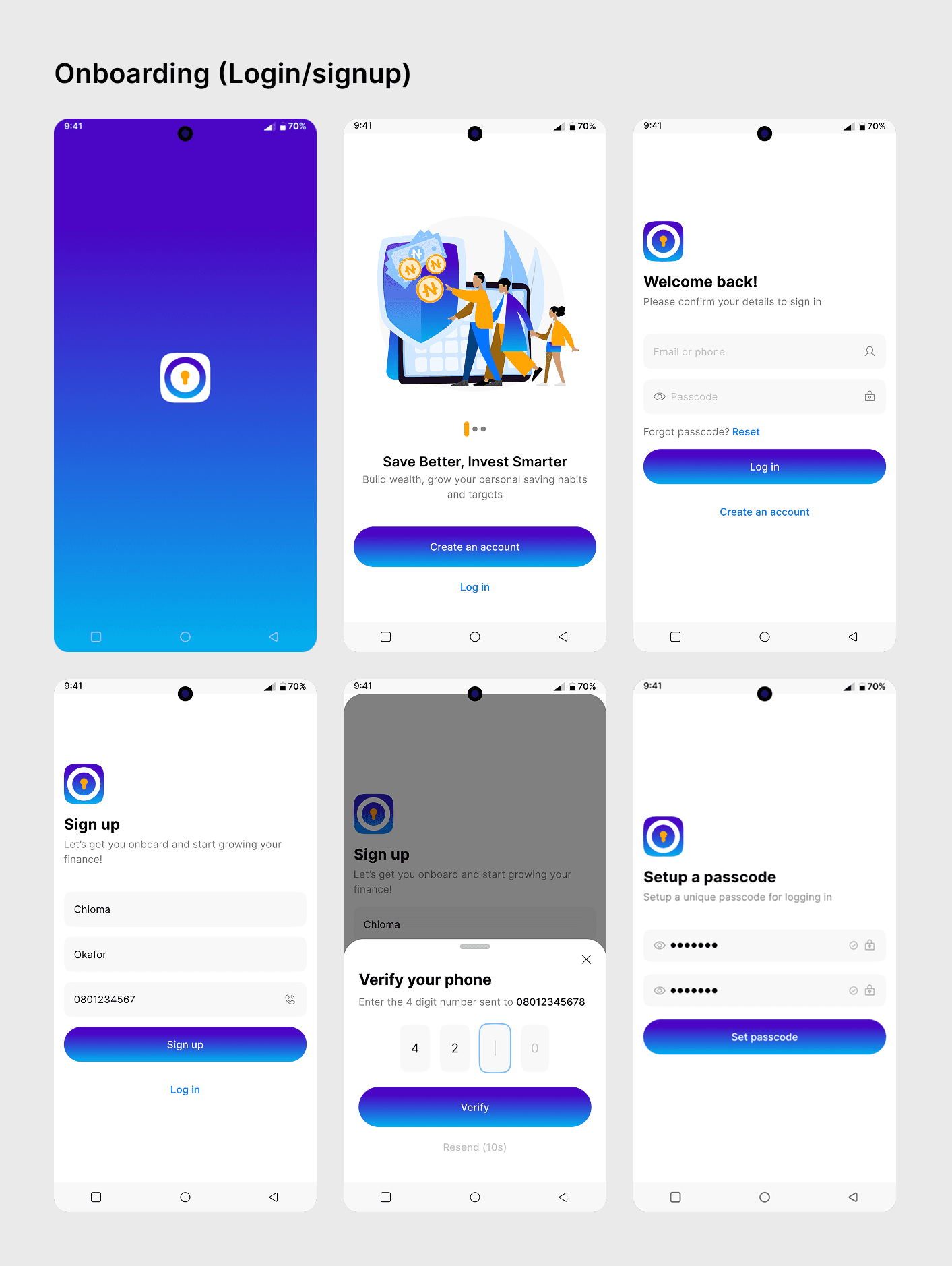
Putting the majority of the users’ background in perspective, onboarding with only email wouldn’t suffice. So I made provision for sign-up with a phone number to cater for users who might not have email.
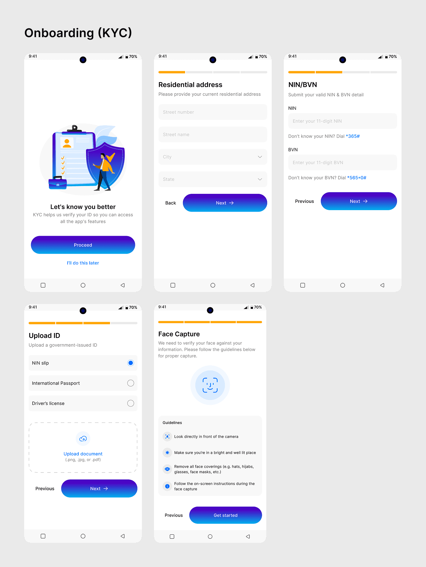
Also KYC wasn’t initially compulsory during onboarding but progressive, making some features restricted pending completion. This was in order to avoid and reduce churn rate during signups.
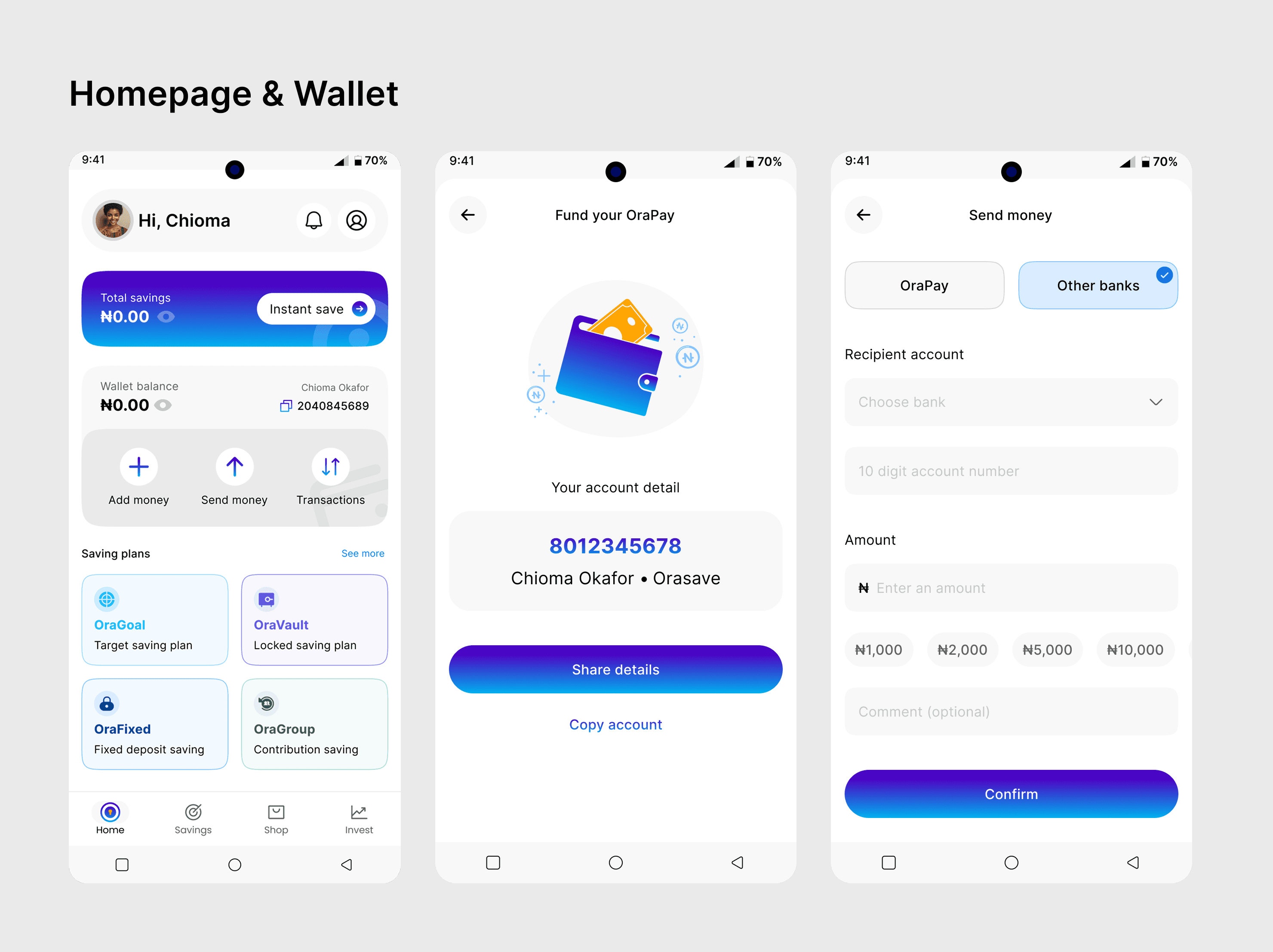
Homepage & Wallet
The homepage was designed to feel like a calm starting point For many Orasave users, this screen represents their first real interaction with digital finance. So instead of overwhelming them, the homepage prioritizes reassurance, clarity, and quick access to essential actions.
At the top has the total savings surfaced clearly, with a clear CTA “Instant Save” that opens the quick saving flow (OraFlex). Below that sits the wallet balance, treated as a supporting element rather than the main focus. Orasave is first a savings product, not a banking app—and the hierarchy reflects that. But to facilitate easy money transfer in and out, the wallet system was introduced. Quick actions like Add money, Send money, and View transactions are always within reach, reducing friction for repeat tasks and eliminating the need to dig through menus.
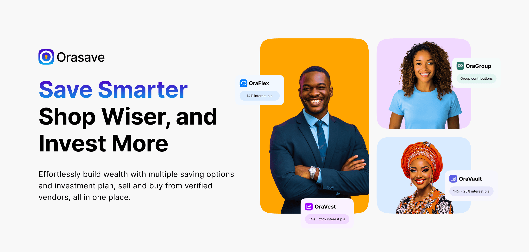
Savings plans are presented as cards—OraGoals, OraVault, OraFixed, and OraGroup for quick actions. Users don’t feel locked into a single financial path; they can explore and grow at their own pace. The homepage isn’t just informational. It’s intentional. Every element answers a simple question: What can I do next?
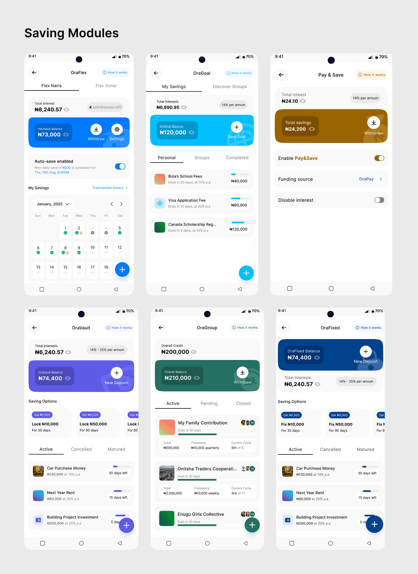
Saving Modules
At the core of Orasave is the saving modules. The team decided to build an ecosystem around multiple saving options by creating features that act like sub-products with the core app.
OraFlex Naira — flexible daily savings and checklist
OraFlex Dollar — users saving against currency instability
OraSpend n' Save — saving alongside everyday spending
OraVault — fixed deposits with top-up options
OraGoal — target-based saving for individuals and thrift groups
OraGroup (Esusu) — for cooperative savings that mirrors traditional credit contribution system.
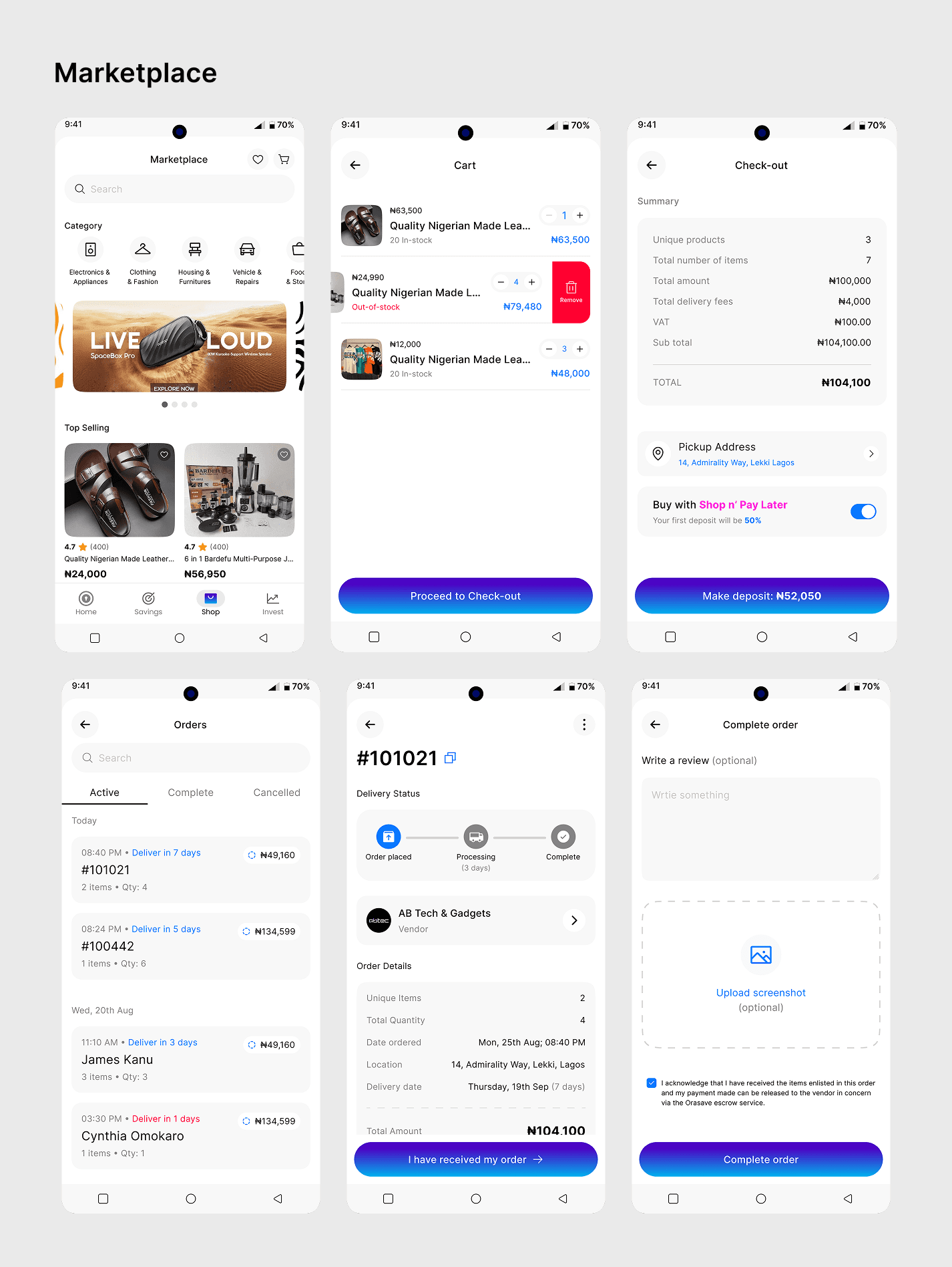
Ecommerce Marketplace
The marketplace was designed to feel familiar, flexible, and trustworthy, bringing everyday shopping into the same space where users save and plan their finances. Users can browse products from verified vendors, explore categories, and discover top-selling items with ease. The cart and checkout experience prioritises clarity—users can adjust quantities, see real-time price updates, and view a full cost breakdown including delivery fees and VAT.
After check-out, users can track their orders through clear delivery stages, manage active and completed orders, and confirm receipt directly within the app. This confirmation triggers the release of funds to the vendor, reinforcing trust and accountability on both sides. Optional reviews and proof of delivery further strengthen confidence in the system, making the marketplace a seamless and reliable extension of Orasave’s financial ecosystem.
Outcome, Metrics & Learnings
To validate our design decisions and track the super-app's performance, I worked with our engineering team to implement a comprehensive analytics setup with custom event tracking across all user touchpoints.
Key metrics we intend to track:
Service discovery rates (how users find new features).
Cross-service adoption patterns.
Payment method preferences by region.
Feature usage patterns across different user types.
Support ticket categories and resolution times.
Analytics framework: Google Analytics 4 with custom events, behavioral tracking, and session recordings across mobile and web platforms
Our dual-mode interface is targeted to improve task completion by 34%, increase wallet and savings engagement by 3.2x, and reduce onboarding time by 68%. Key findings will reveal specific areas for improvement and feature updates.
Team & Credits
Role
People
Product Design Lead
Favour Eseosa (led strategy, research, product decision and stakeholder alignment; oversaw core architecture and design system usage.)
Design Team
1 Product Designer, 2 UI Designers
Key Partners
Engineering, Marketing and Product Management
This case study reflects work completed between September, 2025 and January, 2026 and executed by Deebug Studios.

